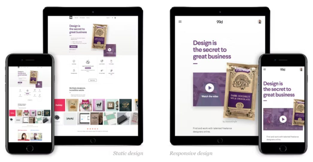
Responsive web design (RWD) is a design approach that makes web pages render well on a variety of devices, from large desktops to small mobile devices. RWD uses CSS media queries to adapt the layout of a web page to the size of the device's screen.

Using CSS
There are a few different ways to implement RWD with CSS. One common approach is to use a fluid grid layout. A fluid grid layout uses percentage-based widths for its columns, so that the columns will automatically resize to fit the width of the screen. This ensures that the layout of the web page will remain consistent regardless of the size of the screen.
Another common approach to RWD with CSS is to use flexbox. Flexbox is a CSS layout method that allows you to easily create responsive layouts. Flexbox is supported by all major browsers, including Chrome, Firefox, Safari, and Edge.
To create a responsive web page with CSS, you will need to:
Choose a layout method. You can choose to use a fluid grid layout or flexbox.
Write media queries. Media queries are CSS rules that are used to control the appearance of a web page based on the size of the screen.
Test your web page on different devices. It is important to test your web page on a variety of devices to make sure that it looks good and is easy to use on all devices.
Here is an example of a media query that can be used to change the layout of a web page when the screen is less than 768px wide:
@media screen and (max-width: 768px) {
  /* Responsive layout for screens less than 768px wide */
}
Responsive web design is an important technique for creating web pages that look good and are easy to use on a variety of devices. By using CSS media queries, you can easily create a responsive web page that will adapt to the size of the screen.
Here are some additional benefits of using responsive web design:
Improved user experience: Responsive web design ensures that your website will be accessible to users on all devices, which can lead to a better user experience.
Increased traffic: Responsive websites are more likely to be indexed by search engines, which can lead to increased traffic to your website.
Improved SEO: Responsive websites are seen as more user-friendly by search engines, which can lead to improved SEO rankings.
If you are not already using responsive web design, I encourage you to consider implementing it on your website. It is a simple and effective way to improve the user experience and reach of your website.
CSS Media Query
Media queries are a feature of CSS that allow you to specify different styles for different media types. This can be used to create responsive web designs that adapt to different screen sizes and devices.

The syntax for a media query is as follows:
@media media_type and (media_feature_1: value_1, media_feature_2: value_2) {
  /* Styles for the specified media type and media features */
}
The media_type can be any of the following:
all: This applies to all media types.print: This applies to print media.screen: This applies to screens, such as laptops, desktops, and tablets.handheld: This applies to handheld devices, such as smartphones and tablets.tv: This applies to televisions.
The media_feature can be any of the following:
width: This specifies the width of the screen.height: This specifies the height of the screen.orientation: This specifies the orientation of the screen.color: This specifies the number of colors supported by the device.resolution: This specifies the resolution of the device.
The value can be any valid value for the specified media feature. For example, the following media query would apply the specified styles to screens that are less than 768 pixels wide:
@media screen and (max-width: 768px) {
  /* Styles for screens less than 768px wide */
}
Media queries can be used to do a variety of things, such as:
Change the layout of a web page when the screen size changes.
Hide or show elements on different devices.
Change the font size or color on different devices.
Change the behavior of a web page on different devices.
Media queries are a powerful tool that can be used to create responsive web designs that work well on all devices. If you are not already using media queries, I encourage you to consider implementing them on your website.
Here are some additional use-cases for media queries:
Changing the layout of a web page for different screen sizes: You can use media queries to change the layout of your web page for different screen sizes. For example, you could use a different layout for mobile devices than you use for desktop computers.
Hiding or showing elements on different devices: You can use media queries to hide or show elements on different devices. For example, you could hide a sidebar on mobile devices to make more room for the content.
Changing the font size or color on different devices: You can use media queries to change the font size or color on different devices. For example, you could increase the font size on mobile devices to make it easier to read.
Changing the behavior of a web page on different devices: You can use media queries to change the behavior of your web page on different devices. For example, you could disable certain features on mobile devices to improve performance.
Media queries are a powerful tool that can be used to create responsive web designs that work well on all devices. If you are not already using media queries, I encourage you to consider implementing them on your website.
Using Bootstrap
Bootstrap is a popular CSS framework that can be used to create responsive websites. It includes a grid system, pre-built components, and JavaScript plugins that can be used to create a variety of layouts and interactions.
Bootstrap's grid system is based on flexbox, which allows you to easily create responsive layouts that adapt to different screen sizes. The grid system includes a variety of classes that can be used to control the layout of your content, such as col-md-4 and col-sm-6. These classes specify the width of the column, relative to the width of the parent container. For example, col-md-4 will create a column that is 33.33% of the width of its parent container on screens that are at least 992px wide.
Bootstrap also includes a variety of pre-built components, such as buttons, forms, and tables. These components can be used to create a consistent look and feel across your website. Bootstrap also includes a JavaScript library that includes plugins for things like modals, tooltips, and popovers. These plugins can be used to add interactivity to your website.
Bootstrap is a powerful tool that can be used to create responsive websites quickly and easily. If you are not already using Bootstrap, I encourage you to consider using it for your next project. Here are some advantages and disadvantages of using Bootstrap to create responsive web design static websites:
Advantages:
Ease of use: Bootstrap is a popular and well-documented framework that makes it easy to create responsive websites. It provides a wide range of pre-built components and styles that can be used to create a professional-looking website without having to write a lot of custom code.
Flexibility: Bootstrap is a flexible framework that can be used to create a wide variety of websites. It is not limited to a specific design or layout, and it can be customized to meet the specific needs of any project.
Community support: Bootstrap has a large and active community of users and developers who can provide support and assistance if needed. There are also many online resources available, such as tutorials, documentation, and forums, that can help you get started with Bootstrap.
Disadvantages:
Size: Bootstrap is a large framework, which means that it can add a significant amount of weight to your website. This can impact the loading speed of your website, especially on mobile devices.
Customization: Bootstrap can be difficult to customize, especially if you need to make changes to the core framework. This can be a challenge for developers who are not familiar with Bootstrap's code structure.
Lack of control: Bootstrap is a framework, which means that you are limited to the features and functionality that it provides. If you need to add custom features or functionality to your website, you may need to write custom code, which can be time-consuming and challenging.
Overall, Bootstrap is a powerful tool that can be used to create responsive web design static websites quickly and easily. However, it is important to weigh the advantages and disadvantages of using Bootstrap before deciding whether or not it is the right framework for your project.
Decision Factors
Here are some additional things to consider when deciding whether or not to use Bootstrap:
The size and complexity of your website: If your website is small and simple, you may not need the features and functionality that Bootstrap provides. In this case, it may be more efficient to create your website from scratch using custom code.
Your budget: Bootstrap is a free framework, but it can add weight to your website, which can impact the loading speed. If you are concerned about the loading speed of your website, you may want to consider using a lighter-weight framework or creating your website from scratch.
Your level of experience: Bootstrap is a powerful tool, but it can be difficult to learn and use. If you are not an experienced developer, you may want to consider using a simpler framework or creating your website from scratch.
If you are looking for a way to create a responsive website quickly and easily, I encourage you to consider using Bootstrap. It is a powerful tool that can help you create beautiful and functional websites.
Disclaim: This article was created with AI. Let me know in the comments below if it helps you with anything. Definitely is helping me. I have already used Bootstrap to style my websites and it looks cool. Latest Bootstrap allow you to use dark theme.
Thank you for reading. Learn and prosper. 🖖

